Problems With Measuring Inequality
January 4, 2020
Originally published on Economics from the Top Down
Blair Fix
Economists often talk about income inequality the same way a doctor would talk about a child’s height. Just as a doctor would say “Sylvia continues to grow taller”, economists say things like “US income inequality continues to grow”. (Full disclosure, I’m sure I’ve said similar things).
On the surface, there seems to be nothing wrong with this type of pronouncement. But when we look under the hood of inequality measurements, there are some serious problems. Unlike height, inequality has no unambiguous dimension. Inequality is something that we must define before we can measure it. We must decide how we will reduce a complex distribution of income to a single number.
The problem is that a single inequality metric cannot tell us about the shape of the income distribution. And as I hope to show here, this shape is important. It determines where the inequality is located.
Inequality at the bottom vs. inequality at the top
To illustrate the problems with measuring inequality, I’m going to look at two hypothetical societies. Both have a Gini index of 0.6, which is roughly the same as the present-day United States (using data from the World Inequality Database). If you’re not familiar, the Gini index is a popular measure of inequality that ranges from 0 (no inequality) to 1 (maximum inequality). So a Gini index of 0.6 is quite large.
The point of this example is to show that the Gini index alone tells us very little about inequality. Why? Because the Gini index doesn’t tell us where the inequality is located. I’ve created one society to have income inequality at the bottom of the distribution, among the poor. The other society has inequality at the top of the distribution, among the rich. [1]
Let’s look at the difference between these two societies.
The probability density of income
We’ll begin by looking at the probability density of income. ‘Probability density’ is a fancy way of saying ‘the proportion of people with a given income’. In our density plot, income size is shown on the x-axis. On the y-axis we plot the relative number of people with the given income. The higher the y-value of the density curve, the greater the proportion of people with the given income.

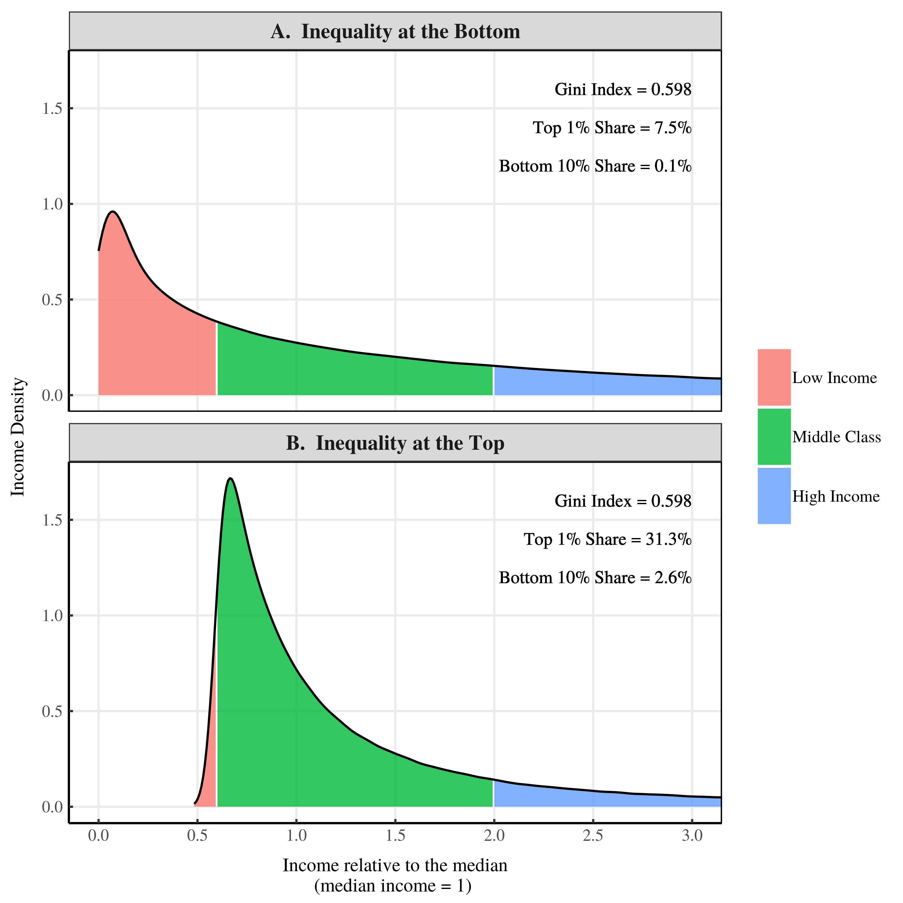
Figure 1: Income density plots for a society with inequality at the bottom and a society with inequality at the top
Figure 1 shows the income density curves for our two societies. I’ve made the median income of both societies equal to 1. So a value of 3 on the x-axis indicates an income that is 3 times the median.
Figure 1A shows a society with inequality at the bottom of the distribution. Figure 1B shows a society with inequality at the top of the distribution. By construction these two societies have the same Gini index. But that’s about all that they have in common.
Other measures of inequality are shockingly different. Let’s look at the top 1% income share. In Figure 1A, the top 1% of earners take home 7.5% of all income. But in Figure 1B, the top 1% earn over 31% of all income. Bottom income shares are also radically different. In Figure 1A, the bottom 10% of earners take home just 0.1% of all income. But in Figure 1B, the bottom 10% earn 2.6% of all income.
Think about these results. We have three different measures of inequality that each give contradictory results. According to the Gini index, both societies have the same inequality. But according to the top 1% share, the society with inequality at the bottom has less inequality than the society with inequality at the top. But if we measure inequality using the bottom 10% share, the reverse seems to be true.
At this point, I hope your head is spinning. How can three different measures of inequality show three (seemingly) contradictory results? To answer this question we need to look at how our two societies differ.
Differing Class Structure
If you go back to Figure 1, you’ll see that I’ve divided our hypothetical societies into three classes: low income, middle class, and high income. Yes, this class scheme is arbitrary. But it’s useful to illustrate the difference between our two societies.
I’ve used the income thresholds adopted by US statisticians. Individuals with income that is less than 60% of the median are classified as “low income”. Individuals with income between 60% and 200% of the median income are classified as “middle class”. And individuals with income that is greater than 200% of the median are classified as “high income”.
Using these class divisions, let’s look at the differences between our two societies. We’ll start with class size. Figure 2 shows the proportion of people in each class:
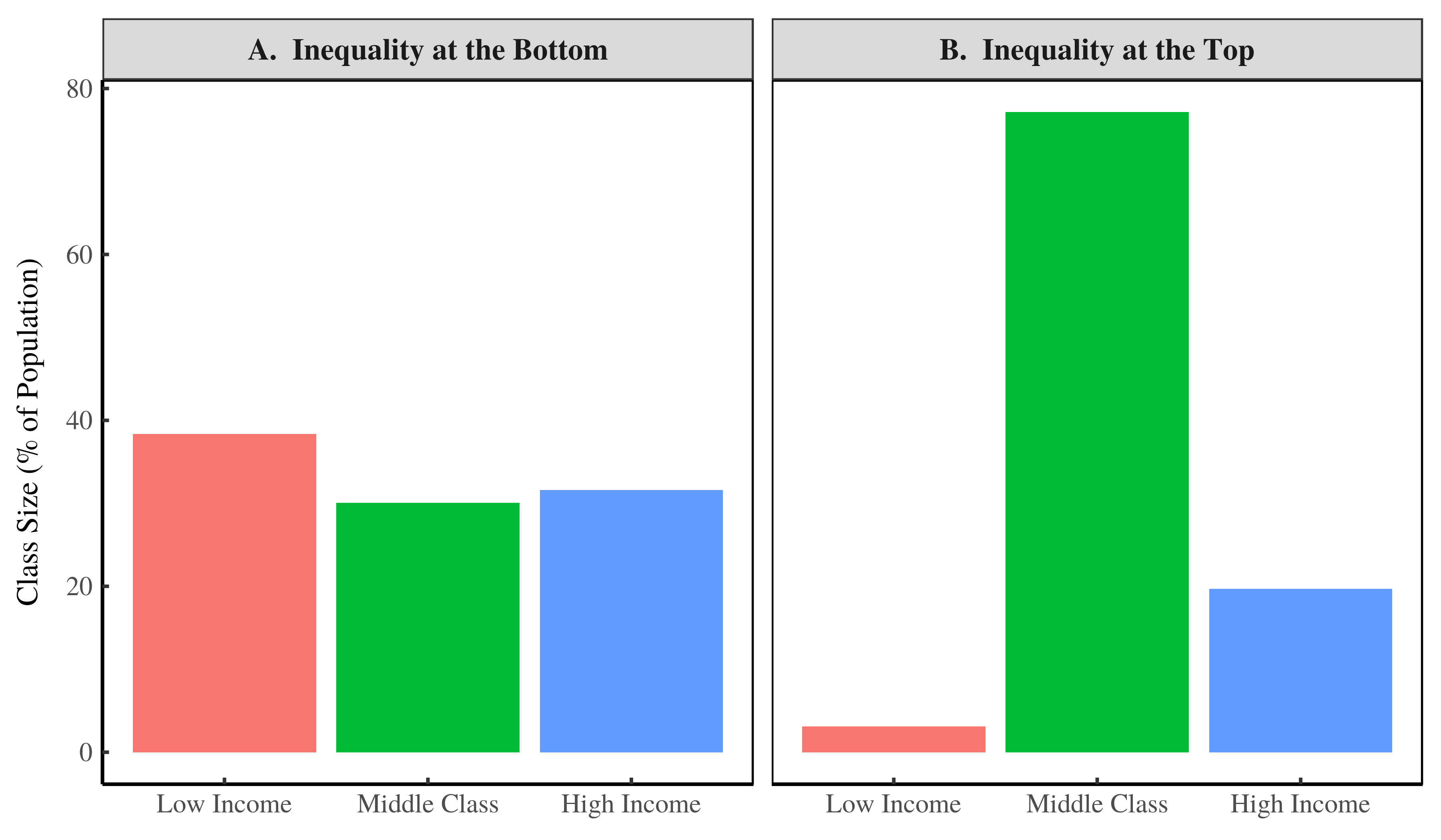
Figure 2: Relative class size in our two societies.
In our society with inequality at the bottom (Fig. 2A), the three classes are about the same size. But in our society with inequality at the top (Fig. 2B), the vast majority of people are middle class. The take home is that these two societies are very different.
Next, we’ll look at the Gini index within the different classes of each society. Here’s the result:
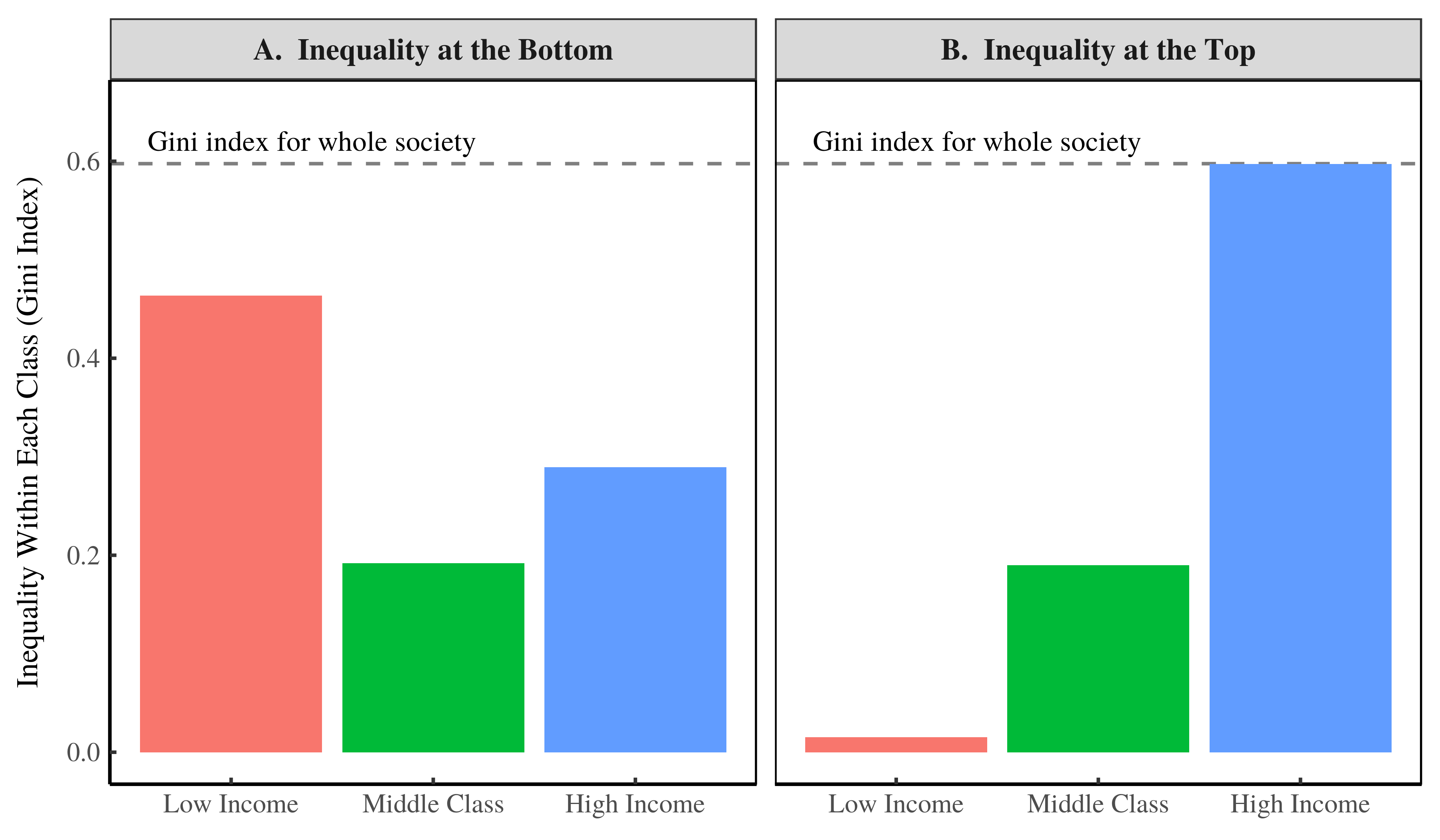
Figure 3: The Gini index within each class of our two societies.
Now you can see the difference between having inequality at the bottom of the distribution versus having inequality at the top. When there is inequality at the bottom (Figure 3A), the Gini index is greatest among individuals with low income. But when there is inequality at the top (Figure 3B), the Gini index is greatest among individuals with high income. [2]
The full income distribution in log-scale glory
To really understand the difference between our two societies, we need to look at the income distributions using a logarithmic transformation.
Under a log transformation, the numbers 1, 10, 100, and 1000 become 0, 1, 2, and 3 (respectively). This transformation compresses the distribution, allowing us to better see both the left and right tails. Seeing these tails is important, because that’s where the inequality lives.
Using a log transformation, let’s replot our income density curves from Figure 1. On the x-axis, we plot the logarithm of income. On the y-axis, we plot the logarithm of income density. Using this transformation, our density curves now look like this:
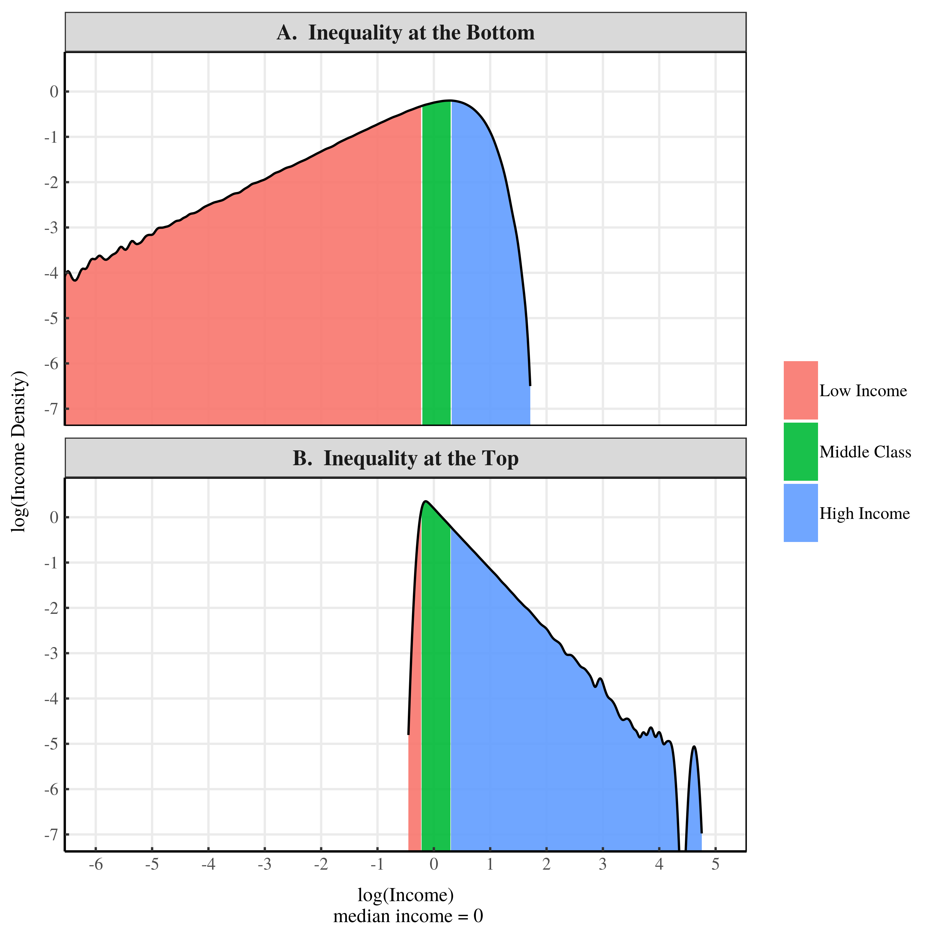
Figure 4: Income density of our two societies using a log transformation.
This log transformation compresses the middle of the distribution (look at how squished the middle class becomes) and highlights the income distribution tails. And yes, I do mean tails (plural). Income distributions have a tail on both the left side (small incomes) and the right side (large incomes). A log density plot highlights both tails.
What matters for inequality is the ‘fatness’ of each tail. A ‘fatter’ tail means more inequality. On a log density plot, the fatness of the tail is indicated by the slope of the curve. A shallower slope indicates a fatter tail, meaning more inequality. A steeper slope indicates a thinner tail, meaning less inequality.
With this in mind, lets analyze the trends in Figure 4. Our society with inequality at the bottom has a fat left tail and a thin right tail (Fig. 4A). So in this society, inequality is concentrated at the bottom of the distribution. In our society with inequality at the top, the opposite is true. This society has a thin left tail and a fat right tail (Fig. 4B). So almost all of the inequality occurs at the top of the distribution.
To conclude, both of these income distributions have fat tails, which is why they both have a large Gini index. But one has a fat left tail and one has a fat right tail. So despite having the same Gini index, these societies are very different.
Why the Gini Index is blind to the ‘location’ of inequality
I hope I’ve convinced you that there are fundamental problems with using the Gini index by itself. The Gini index gives a measure of how much inequality there is. But it gives no indication about where the inequality lives. To understand this problem, we need to understand how the Gini index is constructed.
The Gini index is defined by something called the ‘Lorenz curve’. The Lorenz curve is a way of visualizing how income size relates to the share of total income.
To make a Lorenz curve, we put everyone’s income in ascending order (from smallest income to largest income). Then we calculate the percentile of each income (it’s rank in percentage terms). Next, we calculate the share of income held by all individuals below each percentile. To make the Lorenz curve, we plot the income percentile on the x-axis and the cumulative share of income on the y-axis. Here’s an example.
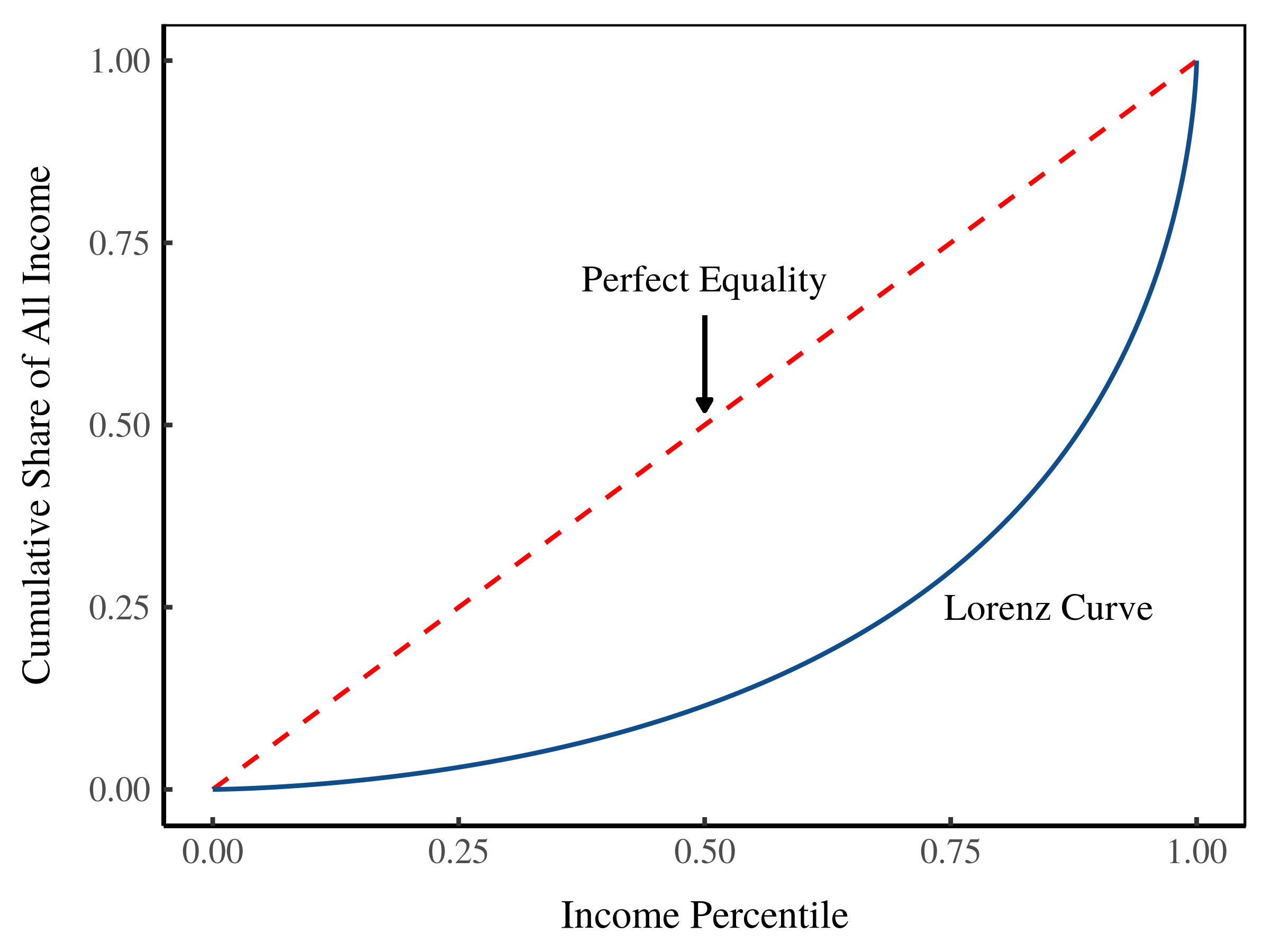
Figure 5: The Lorenz curve.
To make sense of a given Lorenz curve, we usually compare it to the Lorenz curve for a perfectly equal society. In such a society, the income share held by each percentile is the same as the percentile itself. For instance, the bottom 10% of individuals will earn 10% of all income, the bottom 90% will earn 90% of all income, and so on. In a perfectly equal society, the Lorenz curve is a straight line (the dotted line in Figure 5).
The Gini index is proportional to the area between the observed Lorenz curve and the Lorenz curve for a perfectly equal society. The larger this area, the larger the Gini index.
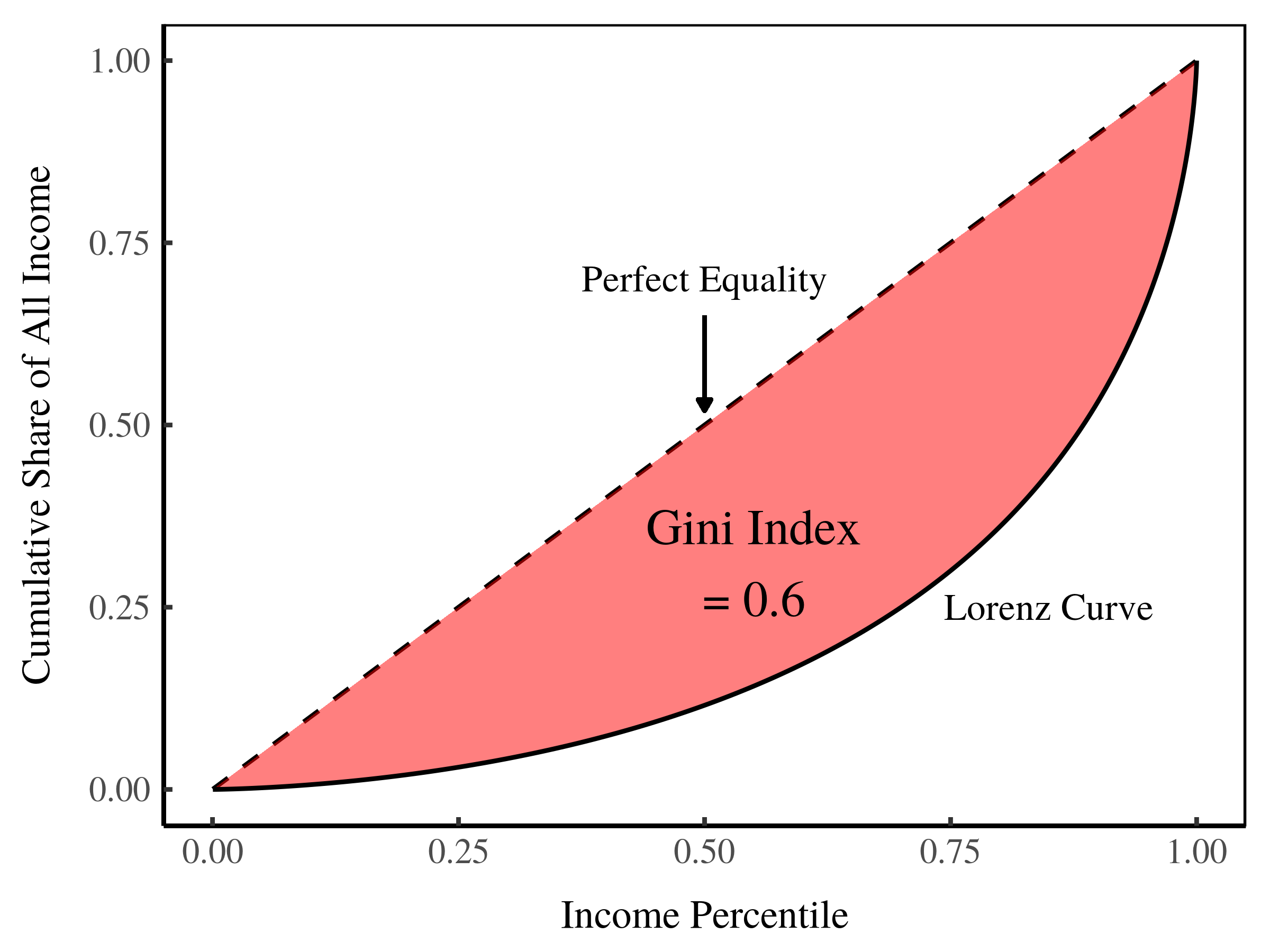
Figure 6: Defining the Gini index using the Lorenz curve.
Here’s the problem with the Gini index. It tells us about the size of the area between the given Lorenz curve and the line of perfect equality. But the Gini index doesn’t tell us about the shape of this area. And the shape, I argue, is important.
Now that we’ve defined the Gini index, let’s look at the Lorenz curves in our two hypothetical societies:
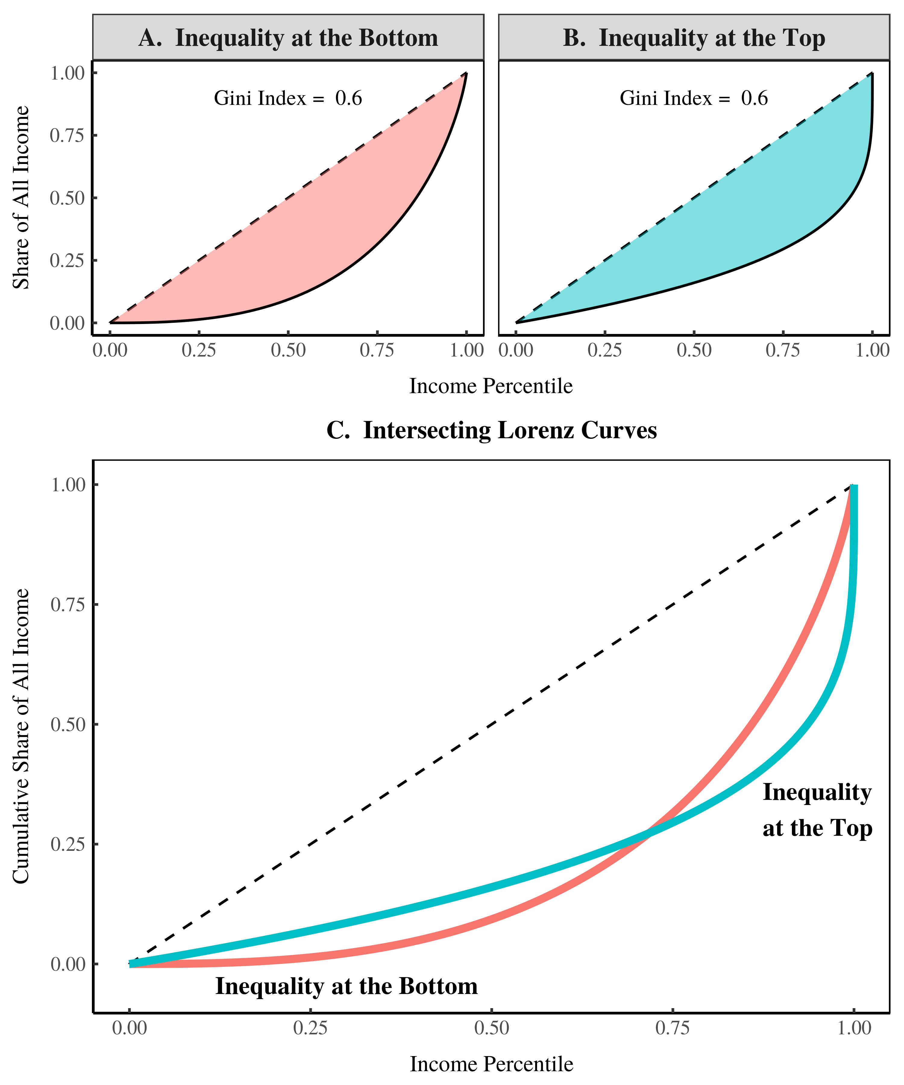
Figure 7: The Lorenz curves of our two societies.
Our two societies have the same Gini index because they have the same area between their respective Lorenz curves and the line of perfect equality (Figs 7A & 7B). Yet the shapes of the two Lorenz curves are very different.
The way to interpret the Lorenz curve is to look at its vertical distance from the line of perfect inequality. The greater this distance, the greater the inequality at the given income.
In our society with inequality at the bottom, the Lorenz curve is far from the line of perfect inequality at the bottom of the distribution. In our society with inequality at the top, the Lorenz curve is far from the line of perfect inequality at the top of the distribution.
Note that our two Lorenz curves intersect one another (Fig. 7C). When this happens, it means that different measures of inequality will give conflicting results about which society is more unequal. When Lorenz curves intersect, we cannot rely on any single measure of inequality. To get the whole story of inequality, we need to use multiple metrics.
Safety nets vs. income caps
My discussion so far has been quite technical. I’ve tried to show you how two very different societies can still have the same Gini index. Now I’l reflect on what these hypothetical societies mean for the real world.
An income cap, but no safety net
Let’s start with our society that has inequality at the bottom. In real-world terms, this is a society with no social safety net. If you live in this society, there is no limit to how poor you can be. To give this context, suppose this society had a median income of $40,000 — about the same as the US. The minimum income in this society would be about a 0.01 cents. So the poor are starving to death.
But while this society allows extreme poverty, it also limits large incomes. In simple terms, we can think of this as an income cap. If the median income was $40,000, the maximum income in this society would be about 1.7 million dollars. In other words, our ‘inequality at the bottom’ society has no billionaires and virtually no millionaires. To summarize, it is a society with an income cap but no safety net
A safety net, but no income cap
In contrast, our society with inequality at the top has a strong social safety net. If the median income was $40,000, the minimum income would be about $20,000. In effect, this society has a guaranteed basic income.
But while this society has is a strong safety net, it is still very unequal because it allows stupendously large incomes. If the median income was $40,000, the maximum income would be about 600 million dollars. This society is rife with millionaires and, and has plenty of billionaires. [3]
Despite having the same Gini index, our two societies are very different. One limits top incomes, but allows the poor to starve. The other has a universal basic income, but doesn’t limit excess at the top.
Which is worse: inequality at the bottom or at the top?
Here’s an interesting question. If two societies have the same Gini index, is it more corrosive to have inequality at the bottom or at the top? To my knowledge this question hasn’t been researched. (If it has, leave a comment and dispel my ignorance).
Although I don’t pretend to have definitive answers, we can get some insight into this question if we reframe it slightly. Is it better to have a safety net or a salary cap? Judging by the use of these policies, inequality at the bottom may be more corrosive.
Many societies have safety nets. They use policies like a minimum wage, welfare, unemployment insurance, and so on. But very few (if any) societies have implemented income caps. (Again, if you know of a society with an income cap, leave a comment).
Professional sports leagues are the only example of a salary cap that I can think of. But note that these leagues cap the income of players. They wouldn’t dream of limiting the income of team owners. If anything, the salary cap on players increases the income of owners.
Does the ubiquity of social safety nets (and the lack of real-world income caps) mean that inequality at the bottom is more corrosive than inequality at the top? Probably. At the very least, it means that implementing a safety net is more politically palatable than capping incomes. Few people are willing to tolerate starvation in the midst of plenty. But if their own income is tolerable, many people will ignore the excesses of the rich.
Inequality: Both ‘how much’ and ‘where’
I hope this post has given you some insight into the problems with measuring inequality using a single number. A single measure does not tell us about the location of the inequality.
Now, sometimes this location may not be important. Suppose one society has a Gini index of 0.2 and the other has a Gini index of 0.8. The difference in Gini indexes is so large that the location of inequality (in each society) isn’t very important. But as Gini indexes get closer together, the location of inequality becomes important.
To understand this location, we need to use multiple measures of inequality. Fortunately, this is now easy to do. For many countries, the World Inequality Database publishes enough data that we can construct almost any inequality metric we want.
To conclude, we need to move beyond the simple idea that ‘inequality’ can be captured by a single number. In reality, inequality is a complex phenomenon that deserves non-reductive analysis.
Notes
[1] If you’re a math person, I’ve used a gamma distribution to generate the income distribution with inequality at the bottom. I’ve used a power-law distribution to generate the income distribution with inequality at the top. I’ve added little bit of Gaussian noise to the power-law to make it a bit more realistic. A pure power-law has cut off at the bottom of the distribution. I’ve added noise to smooth this cut off.
[2] Some of you may be thinking — hey, those class-based Gini indexes in Figure 3 don’t add up to the Gini index of the whole society. True! This is because the Gini index is not ‘additive’. If we merge two classes, one with a Gini index of 0.4 and one with a Gini index of 0.2, the resulting society won’t have a Gini index of 0.6. We can’t add Gini indexes. So the results in Figure 3 are not a contradiction.
[3] We usually define millionaires and billionaires in terms of wealth, not income. But it’s not hard to convert between income and wealth. The very rich mostly earn income from property. So income is the return to wealth. If the return to capital is 10%, someone with $10 million in assets would earn $1 million. With the same rate of return, you’d need $6 billion to earn $600 million.