When Inequality Increases and Decreases at the Same Time
January 25, 2020
Originally published on Economics from the Top Down
Blair Fix
In Problems With Measuring Inequality, I discussed how inequality is an ambiguous concept. The problem, in short, is that a single metric can never capture every aspect of a distribution of income.
Much like we cannot tell the shape of an object from its perimeter or area, we cannot tell the shape of the distribution of income from a single metric of inequality.
From this fact arise some seeming paradoxes. For instance, different measures of inequality can ‘disagree’ with one another. Country A might have a Gini index that is greater than Country B, but a top 1% share that is less than Country B.
In this post, I’m going to discuss another aspect of this ambiguity problem. I’ll show how inequality can increase and decrease at the same time. This may seem like a paradox, but it’s not. When two metrics of inequality disagree with one another, this actually indicates that the shape of the income distribution is changing over time. In other words, the ‘location’ of inequality is shifting.
We’ll first look at the theory behind how inequality can move in two directions at once. Then we’ll look at evidence showing that this happens in the real world.
The ‘location’ of inequality
In Problems With Measuring Inequality, I discussed two different types of inequality:
- Inequality at the bottom of the distribution
- Inequality at the top of the distribution
In theoretical terms, ‘inequality at the bottom’ means a fat left tail in the distribution of income. ‘Inequality at the top’ means a fat right tail.
In real-world terms, these two extremes correspond to different social values. A society with inequality at the bottom does not care about poverty and hence has no safety net. But this society puts strict limits on top incomes. It’s a society with plenty of paupers but no billionaires.
In contrast, a society with inequality at the top abhors poverty, and so has a strong safety net — effectively a universal basic income. But this society doesn’t limit the excesses of the rich. It’s a society with no paupers, but plenty of billionaires.
When the ‘location’ of inequality changes
So far I’ve discussed the two types of inequality as occurring in different societies. But it’s also possible for the location of inequality to change over time in a single society. When this happens, our measures of inequality can disagree with one another. Inequality can go in both directions at once.
To illustrate how this works, let’s imagine a society that shifts inequality from the bottom to the top of the distribution. Figure 1 shows what this would look like.
 Figure 1: Inequality moving from the bottom to the top of the distribution. This figure shows a changing distribution of income within a single country. The left tail of the distribution of income gets thinner while the right tail gets fatter. Consequently, the Gini index decreases while the top 1% share increases.
Figure 1 uses a log transformation so that we can see both the left and right tails of the distribution. The x-axis shows the logarithm of income. Under this transformation, the numbers 1,10,100, and 1000 become 0, 1, 2, and 3 (respectively). I’ve normalized income so that the median occurs at x = 0.
The y-axis in Figure 1 shows the probability of finding a given income. A larger y-value means the corresponding income is more common. But instead of showing density, we plot the log of income density. This allows us to see the very small density values in the distribution tails.
To interpret this plot, look at the slope of the tails. A shallower slope indicates a fatter tail, meaning more inequality in the given tail. A steeper slope indicates a thinner tail, meaning less inequality in the given tail.
In our hypothetical society, the slopes of both the left and right tails change over time. The left tail gets thinner, while the right tail gets fatter. So the ‘location’ of inequality has shifted from the bottom to the top of the distribution.
When the location of inequality changes, different measures of inequality can disagree with one another. For instance, the Gini index of this society has decreased from 0.52 to 0.45. Yet the top 1% share has increased from 9% to 19%.
This duel motion of inequality may seem like a paradox, but it’s not. It occurs because the Gini index and the top 1% share are sensitive to different parts of the distribution. The Gini index is more sensitive to inequality at the bottom of the distribution, so it records decreasing inequality in our hypothetical society. But the top 1% share is more sensitive to inequality at the top, so it records increasing inequality.
When the Gini index and the top 1% share move in opposite directions, it’s a sure sign that the location of inequality is changing. Here are the two possibilities:
| Evidence | Interpretation |
| Gini index increases, top 1% share decreases | Inequality is shifting from the top to the bottom of the distribution |
| Gini index decreases, top 1% share increases | Inequality is shifting from the bottom to the top of the distribution |
Some real-world evidence
While it’s theoretically possible for inequality to move in two directions at once, does this happen in the real world? I did some quick analysis, and the answer is yes! There are a handful of countries that have, since 1980, experienced a decreasing Gini index and a growing top 1% share.
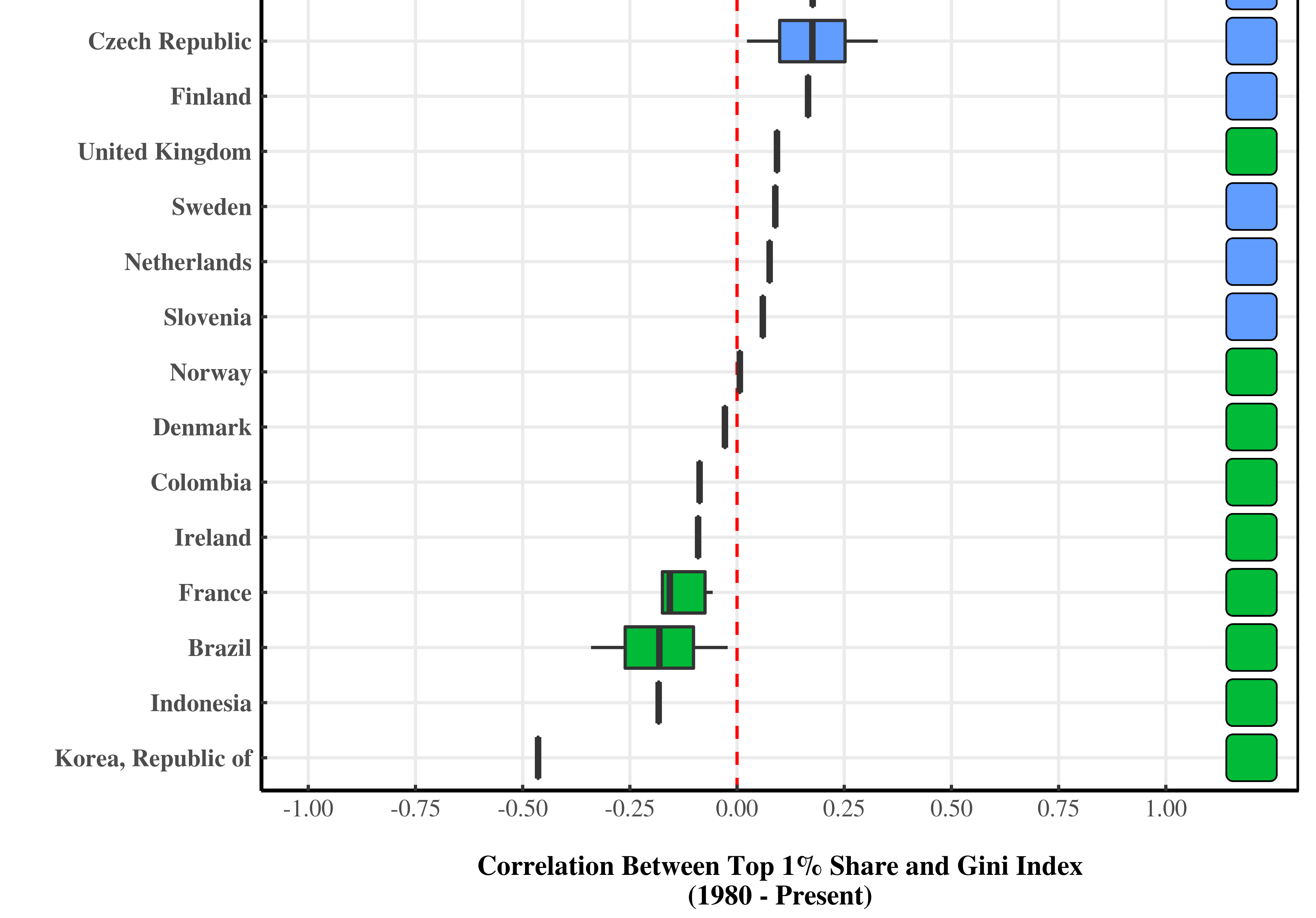
Figure 2 shows the analysis. Here I’ve plotted the correlation since 1980 between each country’s Gini index and its top 1% share of income. The correlation measures how tightly the two series move together. If the correlation is 1, the Gini index and the top 1% move lock step in the same direction. If the correlation is -1, the two series move lock step in opposite directions. A correlation of 0 indicates no relation between the two series.
 Figure 2: Correlation, since 1980, between the Gini index and the top 1% share of income. Boxplots indicate the range of correlation for different data series. Color indicates the direction of the individual metrics. Gini index data is from the World Bank, the OECD, and the UN World Income Inequality Database. Data for the top 1% share is from the World Inequality Database.
The ‘boxplots’ show the range of correlation for different data series in each country. Boxes on the right of the red line indicate a positive correlation, meaning the Gini index and the top 1% share move in the same direction. Boxes on the left of the red line indicate a negative correlation, meaning the Gini index and the top 1% share move in opposite directions.
Next, I’ve used color to show the direction of the individual metrics. Blue boxes indicate that both the Gini index and the top 1% share have increased. Red boxes indicate that both inequality metrics have decreased. Green boxes indicate that the top 1% share has increased while the Gini index has decreased.
Let’s break down the results. First, in most countries of the world both the Gini index and the top 1% share have moved in the same direction. And with the exception of Turkey, this direction is up. In these countries, we can say with little ambiguity that inequality has increased.
But in six countries — Columbia, Ireland, France, Brazil, Indonesia, and Korea — our metrics of inequality have moved in opposite directions. Interestingly, it’s always the Gini index that decreases and the top income share that increases.
In other words, in each of these six countries, inequality has shifted from the bottom to the top of the distribution.
What’s driving this change?
There are two trends in Figure 2 that need an explanation. First, why is the top 1% share increasing in every country except Turkey? Second, amidst this growing inequality at the top, how have six countries managed to reduce inequality at the bottom? (Assuming this is what has actually happened, meaning there’s no problems with our data).
I don’t pretend to have the answers. But there’s an interesting story here that needs telling. Maybe you want to help me tell it? Drop me a line if you’re interested in doing more research in this area.